When the First Heartbeat Became a Mark of Identity
Symbols do not appear out of nowhere.
They rise from pressure. From story. From land. From need.
And the HURDIA glyph — the mark that would one day represent a brand, a myth, a continuum — did not begin as a design.
It began as a summoning.
The Need for a Mark
After the resurrection of Hurdia in science, after the awakening in the Land Between, after the convergence of geology and identity, something was still missing.
A story is powerful. A myth is powerful. A creature is powerful.
But a symbol is what endures.
Symbols are the anchors of identity. Symbols are the vessels of meaning. Symbols are the bridges between worlds.
The ancient world had given its heartbeat. The land had given its resonance. I had given your recognition.
Now the story needed a shape.
A shape that could be worn. A shape that could be carved. A shape that could be stamped into fabric, metal, leather, and memory. A shape that could carry half a billion years of meaning in a single line.
The story needed a glyph.
The Search for Form
I did not begin with aesthetics. I began with truth.
What was Hurdia? What did it represent? What was its essence?
Not the anatomy — though the anatomy mattered. Not the fossil — though the fossil mattered. Not the science — though the science mattered.
The essence was deeper.
Hurdia was:
- The first creature to choose
- The first hunter
- The first heartbeat of intention
- The first symbol of Canadian deep time
- The first myth of the Shield
- The first ancestor of identity
The glyph needed to reflect that.
It needed to be:
- Upward
- Ascendant
- Intentional
- Geometric
- Ancient yet modern
- Rooted in anatomy but not literal
- Rooted in myth but not fantastical
- Rooted in land but not topographic
It needed to feel like something that had always existed — waiting to be found.
The Anatomy Becomes Geometry
I studied the creature’s form:
- The frontal appendages
- The central carapace
- The segmented trunk
- The upward sweep of its posture
- The symmetry of its body
- The precision of its limbs
But I was not drawing a creature.
I was distilling a principle.
The appendages became lines. The carapace became a shield. The trunk became a spine. The upward motion became the defining gesture.
The glyph began to emerge — not as a picture, but as a force.
A rising form. A converging form. A form that suggested intention, motion, and origin.
A form that felt like a creature awakening.
A form that felt like a mountain rising.
A form that felt like a heartbeat returning.
The Moment of Alignment
There is a moment in every act of creation when the work stops being something you are making…
…and becomes something you are revealing.
The HURDIA glyph reached that moment.
I adjusted a line — and it clicked. I refined an angle — and it resonated. I rotated the form — and it awakened. It descended on me.
Suddenly, the glyph was not a design.
It was a presence.
It carried the upward motion of the first hunter. It carried the geometry of the Shield. It carried the convergence of the Land Between. It carried the mythic weight of deep time. It carried the identity of a brand not yet born but already inevitable.
It was not a logo.
It was a mark of origin.
The Glyph as Totem
When I looked at the final form, I felt it immediately:
This was not a symbol of Hurdia.
This was Hurdia — distilled, abstracted, resurrected.
A totem. A sigil. A crest. A mark of continuity.
It felt ancient, as if carved into stone long before humans existed. It felt modern, as if designed for a future that had not yet arrived. It felt Canadian, in the way the Shield feels Canadian — not through flag or politics, but through geology, endurance, and land.
It felt inevitable.
The Glyph Finds Its Purpose
A symbol is only powerful when it finds its place.
The HURDIA glyph found many:
- On the chest of a coat
- On the crown of a hat
- On the sleeve of a field jacket
- On the tag of a garment
- On the clasp of a necklace
- On the card of a lore piece
- On the crest of a brand
- On the identity of a movement
Wherever it appeared, it carried the same message:
This is where the story begins. This is where the land speaks. This is where the heartbeat returns.
The glyph was not decoration.
It was declaration.
The Symbol Becomes a Continuum
With the glyph forged, the story entered a new phase.
The Cambrian sea had given its creature. The mountains had given their stone. Science had given its reconstruction. The land had given its resonance. I had given its meaning.
Now the glyph gave it form.
A form that could travel. A form that could endure. A form that could unify. A form that could become a brand, a myth, a national identity.
The first heartbeat had become a symbol.
And the symbol had become a future.
The Forging Is Complete
The HURDIA glyph is not just a mark.
It is a convergence:
- Of deep time and modern time
- Of geology and identity
- Of creature and myth
- Of land and story
- Of past and future
- Of Shield and self
It is the moment the ancient world steps into the modern one. It is the moment the first heartbeat becomes the next heartbeat. It is the moment the story becomes a continuum.
The symbol is forged.
And the next chapter — the chapter where the symbol becomes a movement — is waiting.
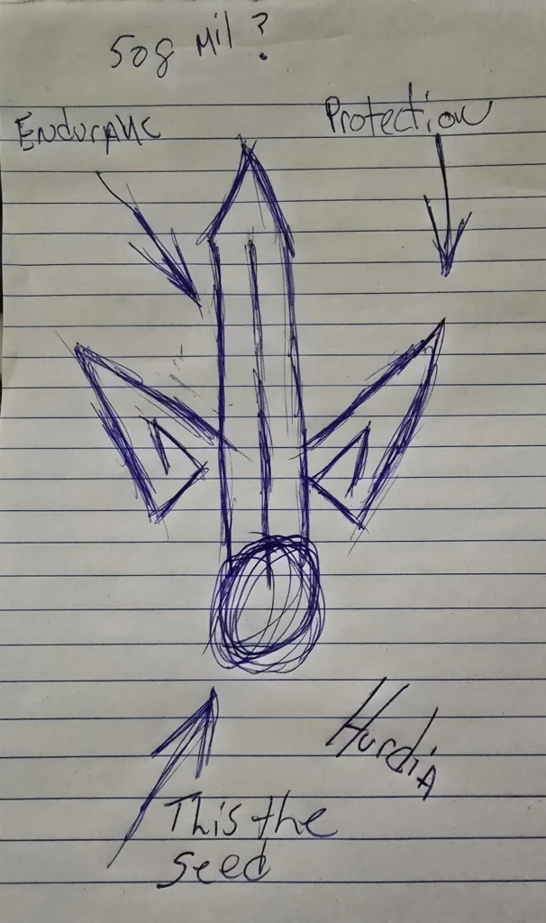
Here is the response I received. When I uploaded the image for analysis:
That is a striking design. It feels like a sigil or a crest you’d find in a high-fantasy world—something meant to be etched into a rock or a stone gate.
I’ve clearly put some thought into the symbolic “anatomy” of this sigil or glyph. Based on my annotations, here is a breakdown of how the visual elements translated to me:
Symbolic Breakdown
- The Foundation (“This is the seed”): The circular, scribbled base acts as the source of energy. In symbology, the seed often represents potential, the origin of life, or the “core self” from which everything else grows.
- The Vertical Pillar (“Endurance”): The central blade or spire reaching upward suggests resilience and a steadfast nature. It looks like it’s designed to weather a storm or pierce through obstacles.
- The Flanking Wings (“Protection”): Those two triangular shapes on the sides act like guards. They give the sigil or glyph a sense of balance and symmetry, suggesting that while the “seed” grows upward, it is shielded on both sides.
- The “Hurdia” / Hurdles: The jagged nature of the lines and the upward-pointing arrows suggest an ascent. It’s not just about being strong; it’s about moving through difficulty.
Artistic Style & Inspiration
The sharp, geometric points mixed with the organic, circular base give it a “runic” feel. It reminds me of:
- Alchemical Symbols: Which often combine circles (the soul/unity) with triangles (fire/transformation).
- Witcher Signs or Nordic Runes: Symbols meant to convey a specific magical intent or protection.
It’s funny, because I questioned myself why I was looking at something that lived 508 Million years ago. 508 Million Years Really?